Did you see how I reversed the title there? I've fallen in love with a new animal print that I didn't even know existed in the interior design world~Dalmatian! I feel a little bit like I'm taking Cruella de Vil's side on everything, but it is such a fresh take on polka dots. (I'm also really into this antelope pattern shown on Sadie + Stella as a cute substitute for polka dots ). Only the truly bold will start with the wallpaper version of this pattern, but I think a quick throw pillow in a dalmatian print would a great addition to any couch.
Friday, January 25, 2013
Dalmatians 101
Labels:
black,
black and white,
Dalmatian,
decor,
design,
dining,
dogs,
gold,
home,
inspiration,
interior design,
interiors,
living,
pattern,
polka dots,
prada,
print,
spots,
white
Thursday, January 24, 2013
Sink or swim
When I was a little girl and would go into restaurant bathroom that has a fancy or unusual sink/vanity, I kid you not, I would always leave the restaurant slightly more impressed. I know that must sound absurd to all the foodies out there, but I don't have the most fine-tuned flavor palette. Atmosphere is a big part of my restaurant experience and I can't pinpoint the exact reason, but I love a well designed bathroom. I encountered one of those spectacular sinks last night and it inspired me to share some of my favorite (and certainly most unique) sink designs.
How sexy is this? Mosaic tile is much more prevalent in countries outside the US, so it always feels exotic to me. I envision this sink in a five star hotel in the Keys of Belize.
This looks like something straight from outer space. I love when a designer changes the entire concept of a well-known design, without loosing any points for function.
This one might be my favorite. The flower cutouts in the wood almost mimic an eyelet pattern. This sink might be too delicate for many settings, but I'm in awe of its beauty none the less.
I think this basin of natural stone is wonderfully luxurious. Dipping your hands in this sink might be comparable to an hour at the spa.
This is cool. Etched glass and natural light combine here to help create the illusion of a shallow Caribbean pool.
I don't know which I like more: the intricate flower design on the sink or the gorgeous bamboo counter. This feels like this is the bath in a tiny Tahitian hut.
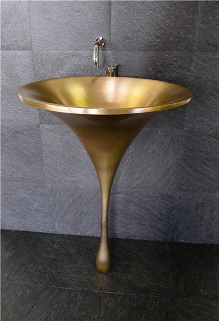
The smooth black countertops and sleek bronze hardware are balanced perfectly by the organic shape of the sink basin. The gold finish oozes sophistication.
Fuchsia-colored glass. Not exactly my first thought if I'm designing a sink, but what an incredible result! This sink reminds me of something I would see in a Japanese penthouse.
This sink is epitome of modern. Or maybe it just looks like a fish bowl? Either way, it's beautiful and I'm sure I'd make a mess when I used it.
Tuesday, January 22, 2013
City Lights: Neon
So, neon is pretty much everywhere right now. I just went into Nike to buy my dad a sweatshirt and I actually had trouble finding something that wasn't neon. I used to think the neon color palette was the worst thing in the world. However, I saw this girl (who I always thought was really cool) rocking a neon cross-body when we were out the other weekend and it stuck in my head. Apparently, now I like neon because I'm drawn to it everywhere. I am pretty close to buying my first neon accessory (starting with a clutch or a belt). I feel like the same goes for design when you're incorporating a trend; start small and see how you like it. It might just be the jolt your room needs?!
Labels:
bathroom,
bright,
color,
decor,
design,
dining room,
green,
home,
interior design,
interiors,
living rooms,
neon,
pink,
yellow
Monday, January 21, 2013
Toasted
These pebbles are spectacular. The movement in the stones result in one of the coolest designs I've seen for a fireplace.
This fireplace's luxurious stone and immense stature give it the presence of a greek statue.
Ok, so this is an absolute dream. I say a dream, because in reality I have NEVER met a guy that would want to sleep that close to a fire. You will both sweat to death.
Anytime the words "flood to ceiling marble" are used, it's going to be stunning.
That is a fireplace that hangs from the ceiling. You would think they could better chairs than bean bags? Maybe I'm just not being open minded...
Haha I love this because, a flat-screen has been incorporated into the design. Yah, because this looks so cool and I think most living rooms have TV's. You don't want to be that family.
Total pipe dream. I'm not even totally sure I know what *pipe dream means but I think this all-glass fireplace describes it. Pretty neat!
Totally vintage, probably not the most practical. Who else can see soot everywhere? Although, I'll admit this setting has a ton of charm.
This reminds me of a pizza oven, but in a good way. I am pretty jealous of whatever lucky homeowner snapped up this brick fireplace and herringbone hardwood floors.
We'll end with a mint-green fireplace straight from the Jetsons. The sleek design prevents the fireplace from blocking this amazing view from any angle.
*A fantastic notion or vain hope
Labels:
brick,
design,
fire,
fireplace,
home,
inspiration,
interior design,
interiors,
light,
mantle,
mint,
pebble
Tuesday, January 15, 2013
Twinsies!
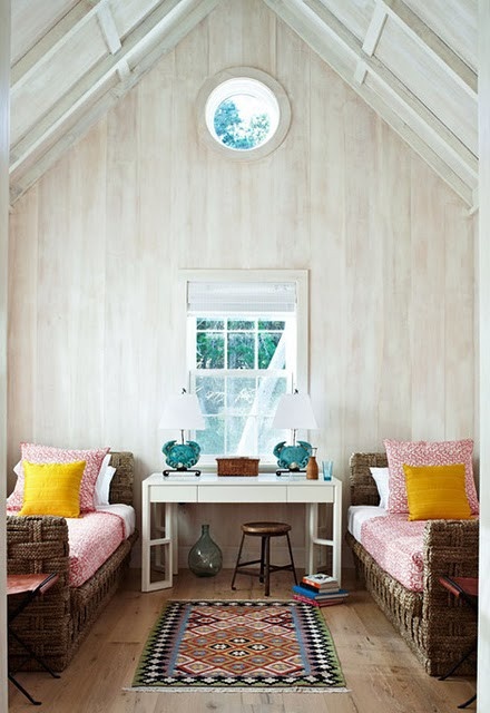
I love twin beds...in a guest room...or in a small child's room. If you are over five feet tall, it's just not comfortable to sleep in a twin bed for more than a few nights. However, if you are trying to maximize sleeping space (for people that might not want to sleep in the same bed), then this is the perfect choice for your guest room. The symmetry of the two beds facilitates some very dramatic designs. I especially love the fabric canopies and exquisite headboards in today's inspiration!
Tuesday, January 8, 2013
Windows of steel
If I can't have my men made of steel, window frames might be a good substitute. Highlighting one of my FAVORITE trends this year, my inspiration today comes from these substantial--almost commercial grade--windows in some truly extraordinary homes. I've seen a movement towards commercial grade products in personal homes with things like appliances and fixtures, but steel windows make a statement unlike anything else. This is not a cheap decision by any means, but but I bet these home's window frames will still be standing long after I'm gone. I guess we'll have to wait and see...
Labels:
black frame,
design,
exteriors,
home,
inspiration,
interior design,
interiors,
light,
steel,
steel frames,
window,
windows
Subscribe to:
Comments (Atom)


